

Designing Visual Identities for Growth and Legacy in Canadian Water Polo
I was honoured to design two logos for Water Polo Canada, each representing an important initiative within the organisation. The first was for "Learn to Play Safe," a program developed to provide members and registrants with essential information on safe sport practices. The second celebrates the Canadian Water Polo Hall of Fame, recognising the outstanding achievements and contributions of Canadians to the sport.
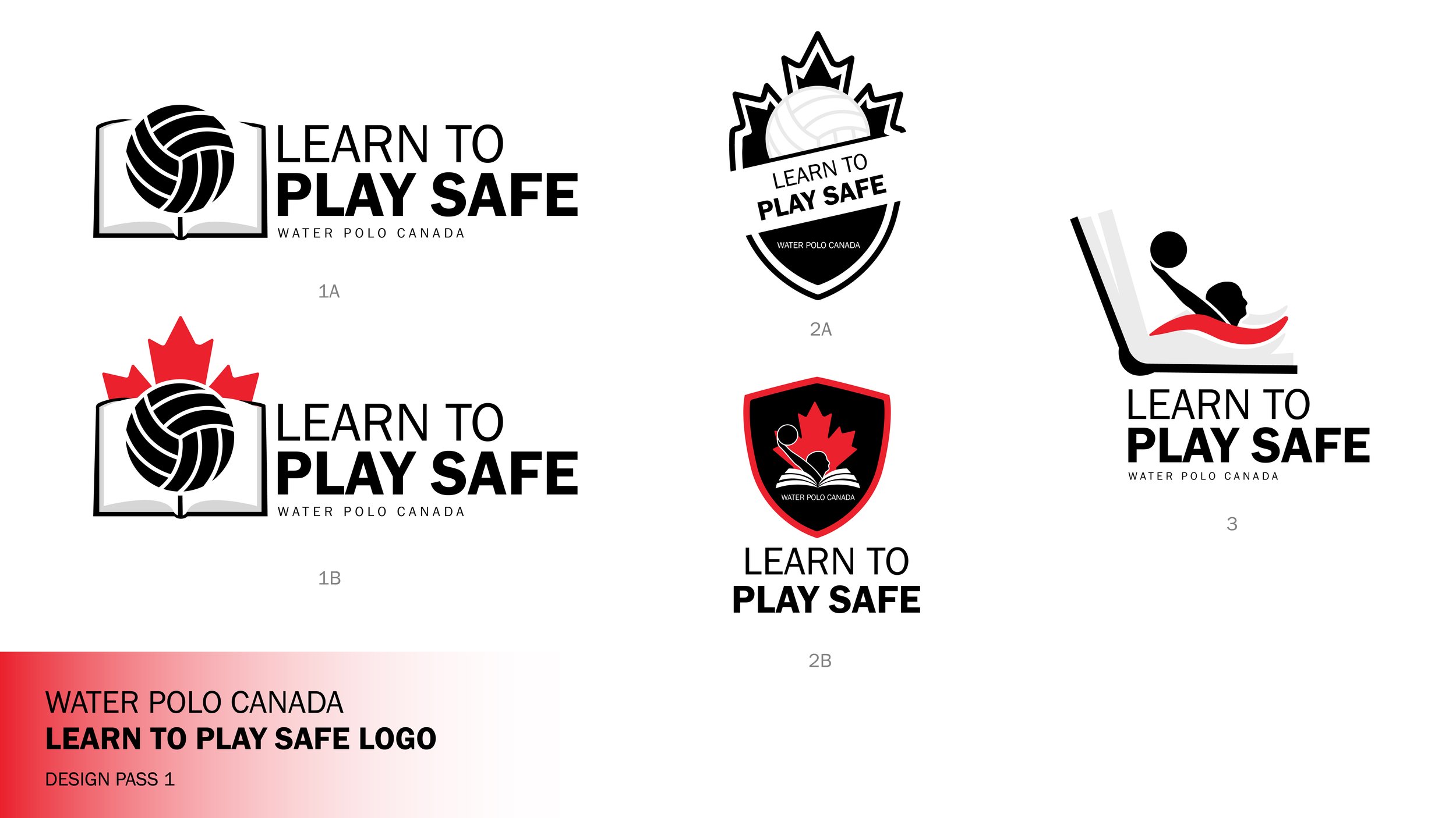
Learn To Play Safe Design Process
My logo designs focus on integrating the existing elements of the original logo, featuring the Canadian maple leaf and a person, into two distinct concepts tailored for different purposes.
For the "Learn to Play Safe" logo, I introduced a book element to emphasise the importance of knowledge, opting for a combination mark that maintains a modern and fresh aesthetic while preserving the essence of the original design.
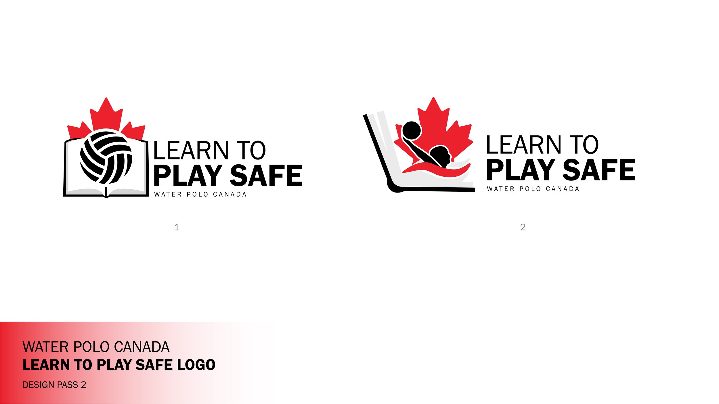
Top 2 Designs Before Final

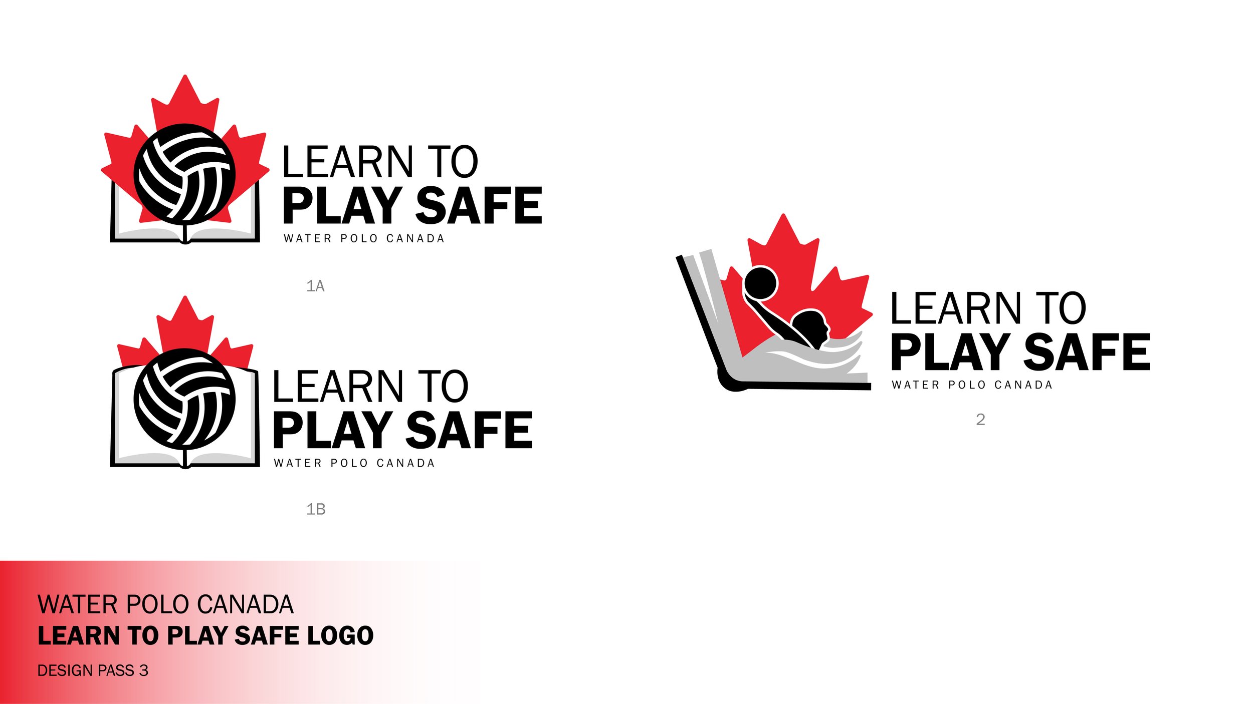
Chosen Design

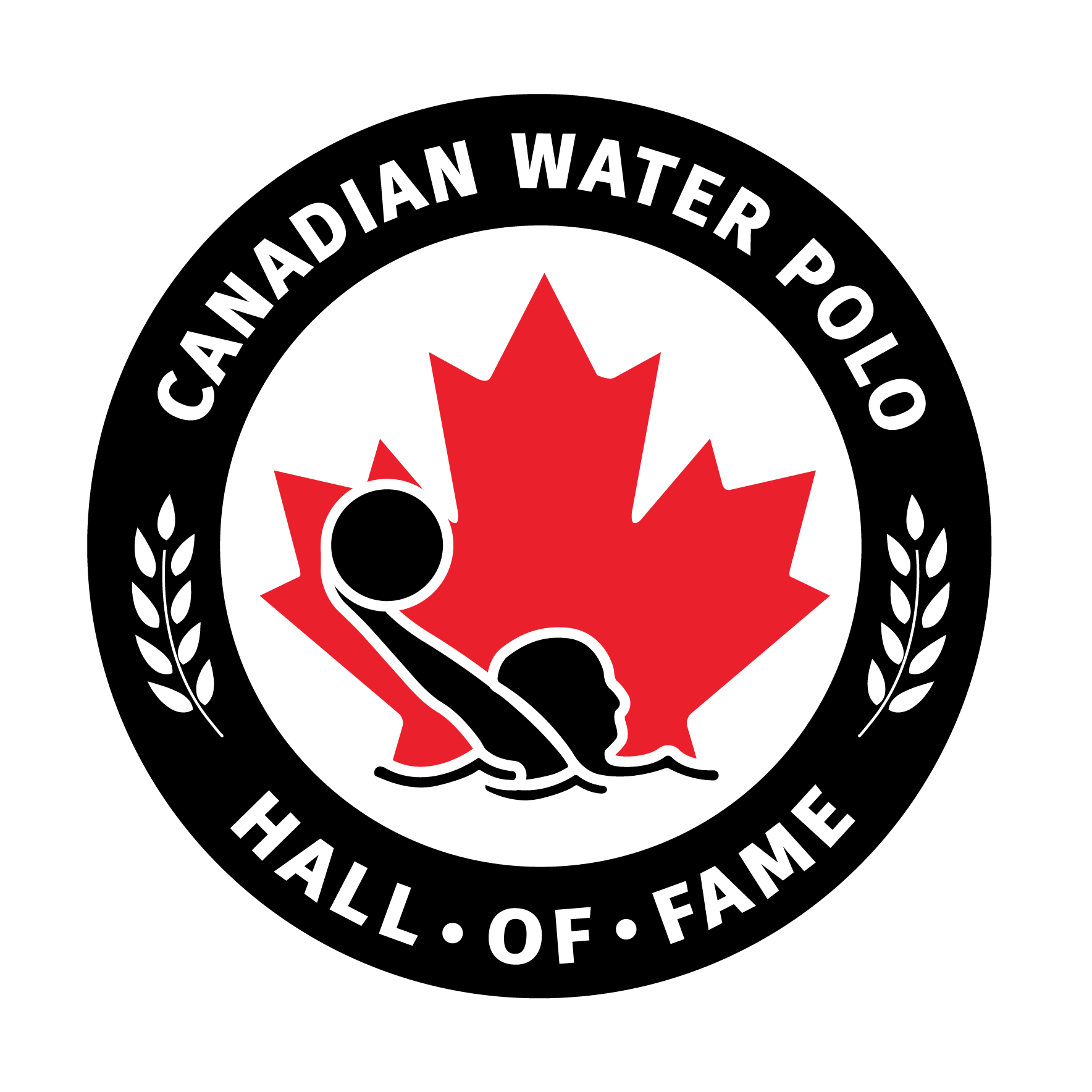
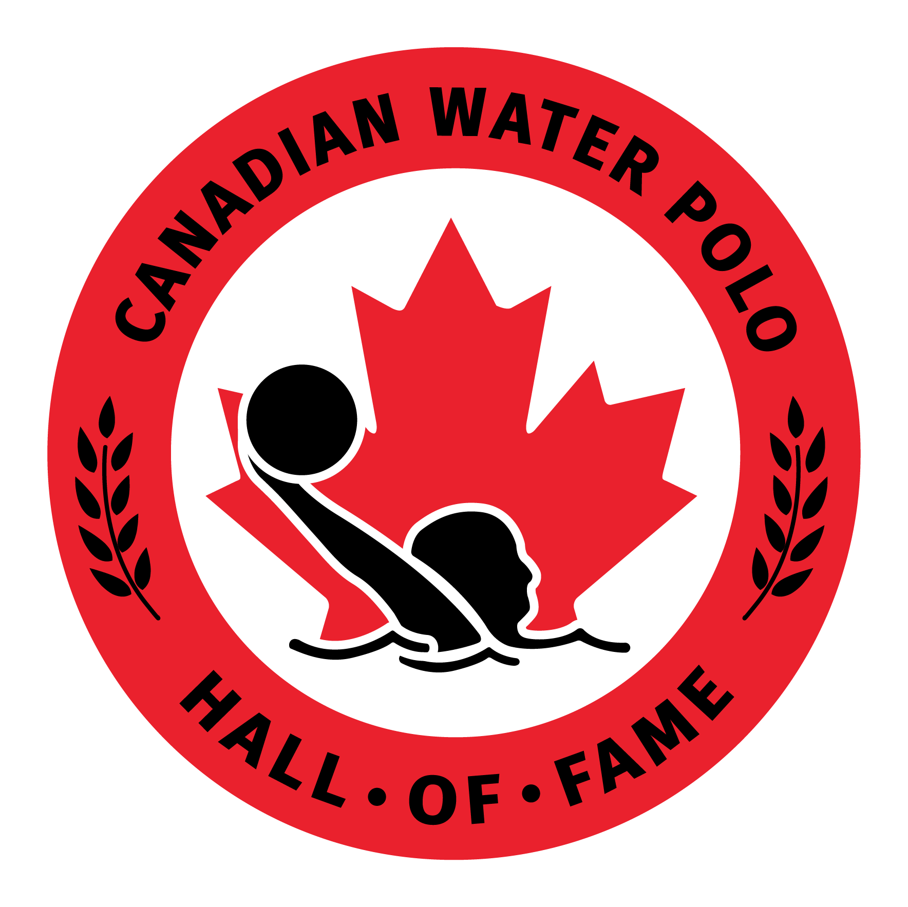
Hall of Fame Design Process
The Hall of Fame logo was designed to resemble a medal, incorporating laurel imagery to evoke achievement and honour. Rather than creating something entirely new, the goal was to evolve Water Polo Canada’s existing logo into a distinct mark for the Hall of Fame, building on its established identity. A key challenge was balancing the two long names—Canadian Water Polo Hall of Fame and its French counterpart—while maintaining a cohesive, visually balanced composition. The official final version is bilingual, but I’m presenting the English version here to better highlight the design details. Both logos respectfully build on Water Polo Canada’s branding while serving the unique goals of each initiative.


Top 2 Designs Before Final
Chosen Design
Discover More
Want to see more of my work? Click below to explore more of my design projects.